Project
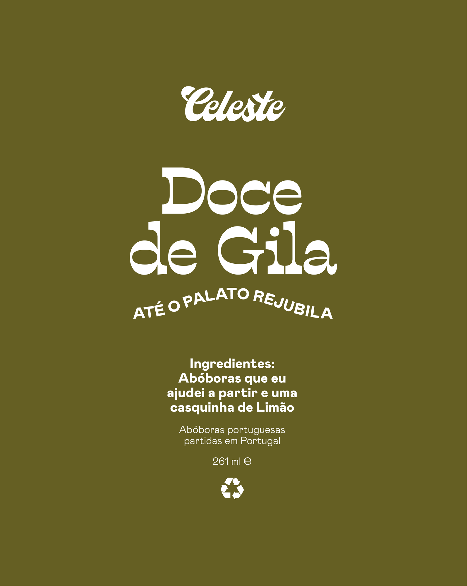
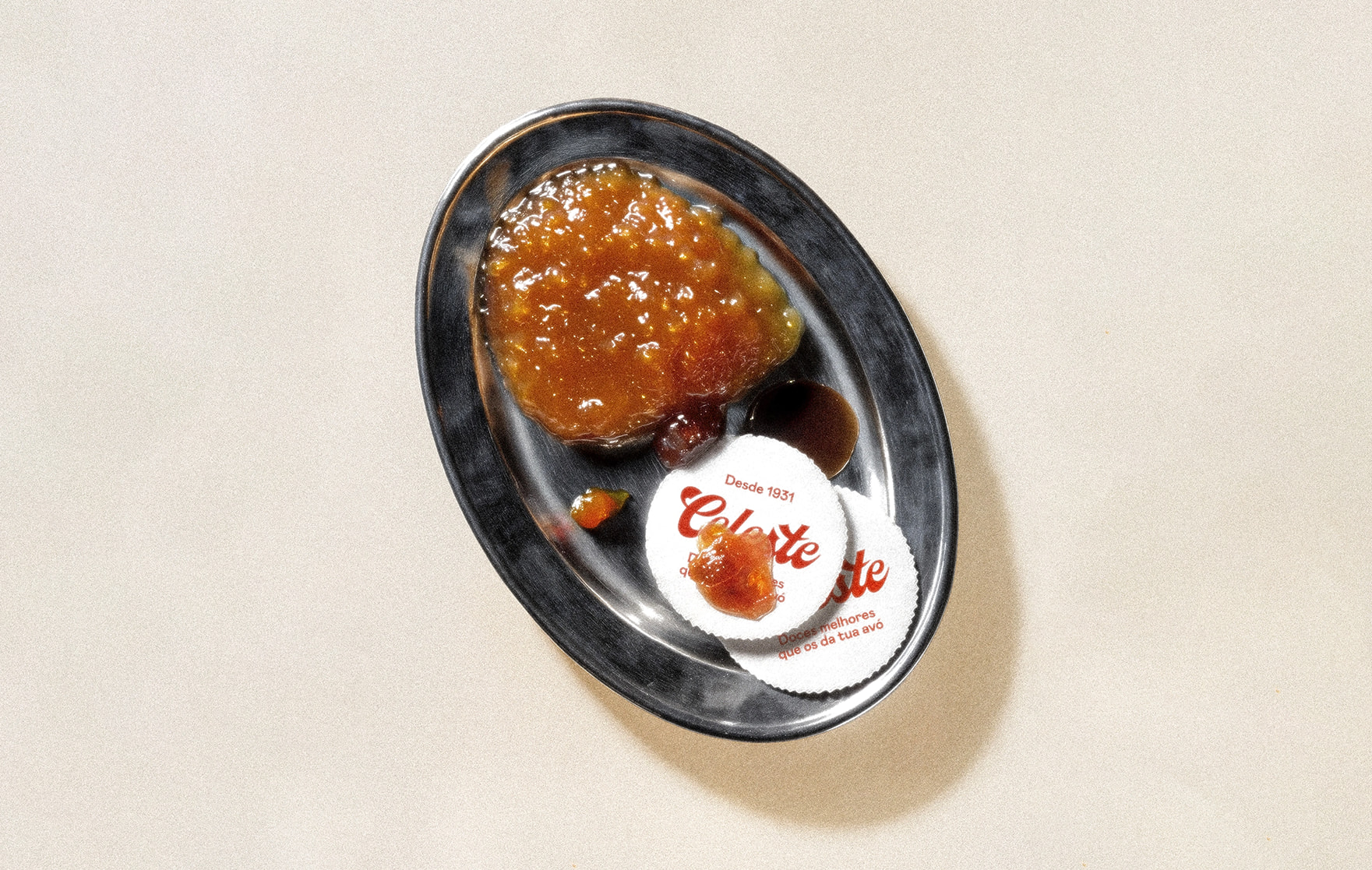
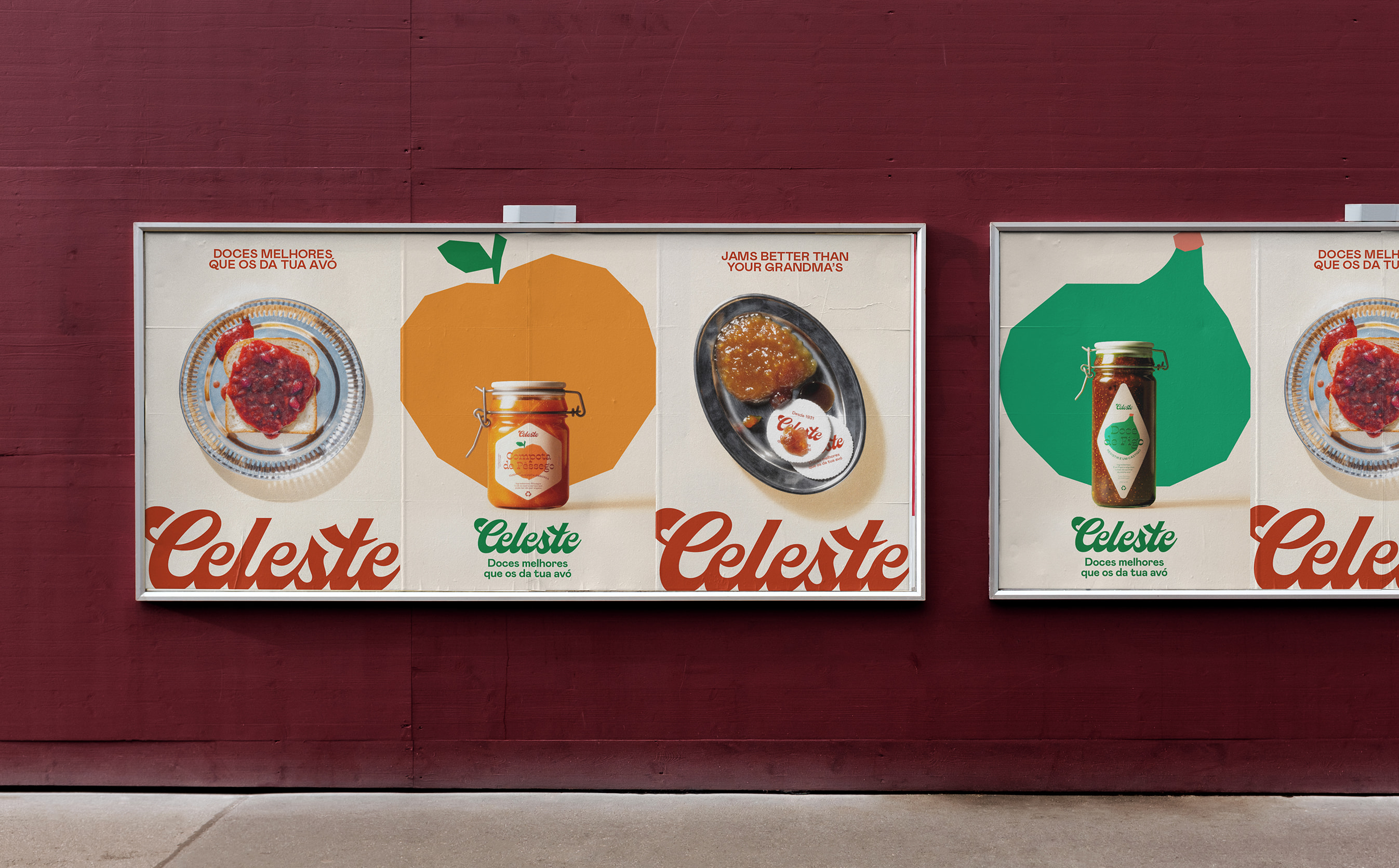
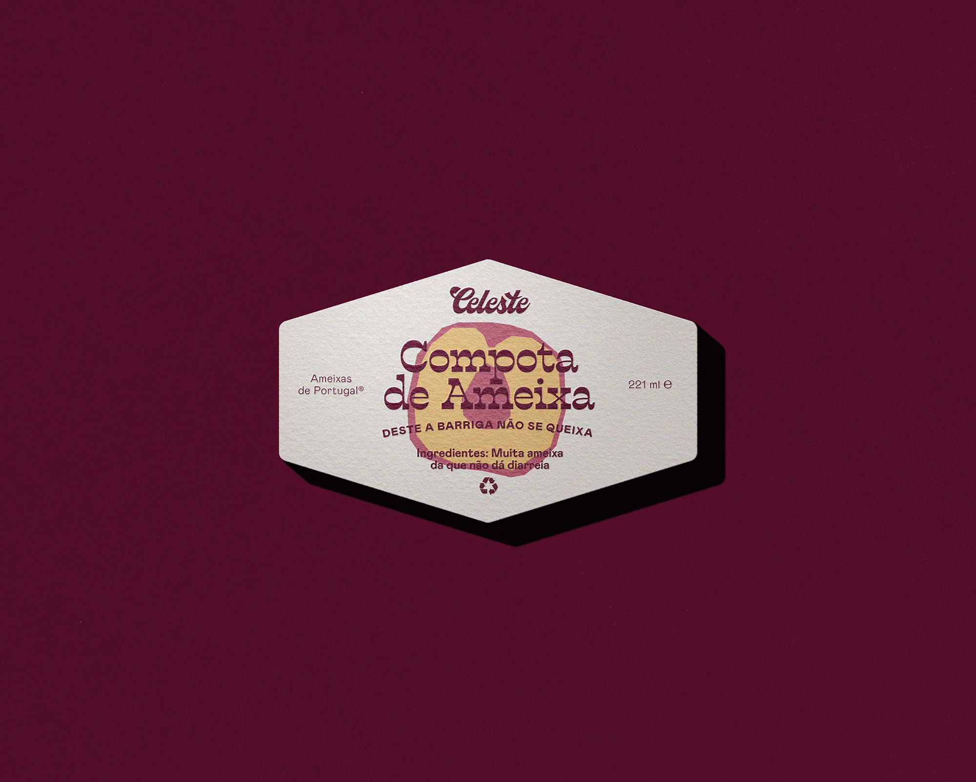
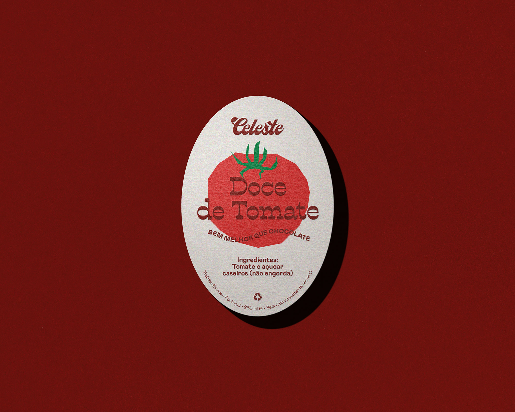
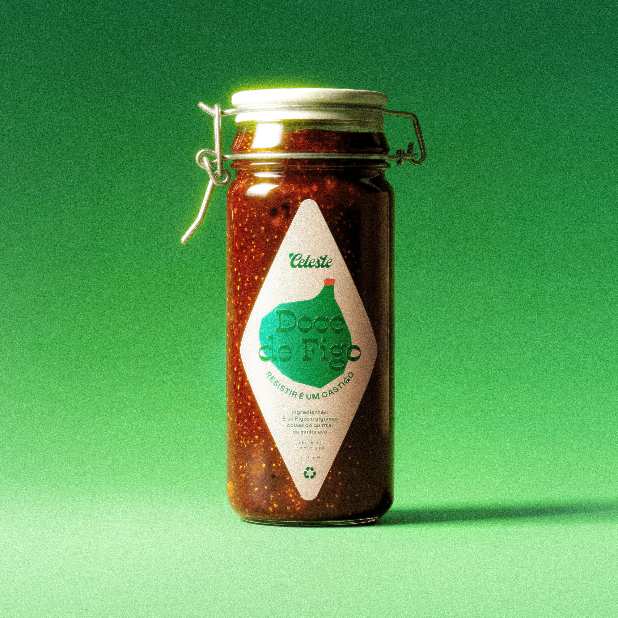
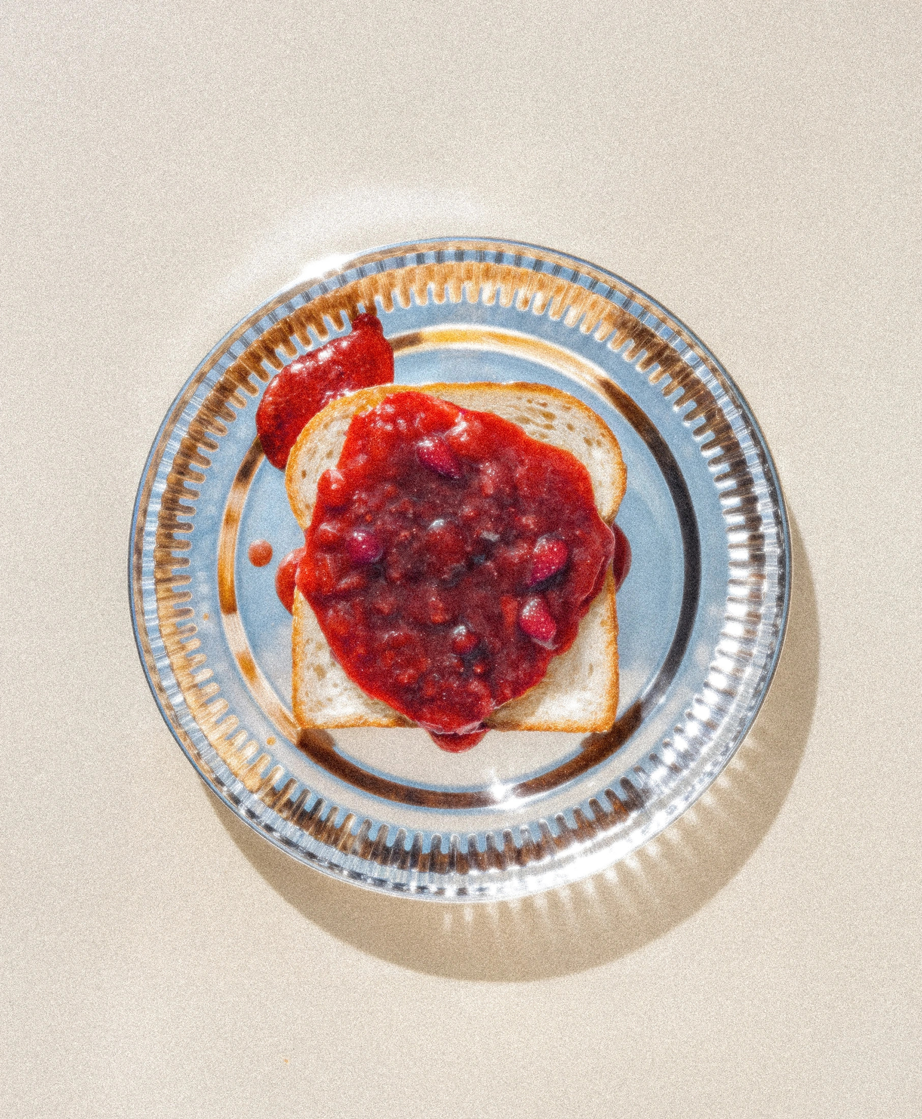
The Celeste brand was born as a tribute to the jams my grandmother Teté (nickname for Celeste) used to make. At the time, there was no Portuguese premium and artisanal jam brand with a similar positioning: young, relaxed, high quality and handmade. The logo is a recreation of my grandmother's signature, intended to preserve the handcrafted feel of the brand. The rectilinear illustrations contrast with the curves of the chosen typeface, and the labels are filled with playful, good-humoured copy. The photography direction aimed to position the brand, while modern, within a more vintage aesthetic, connected to the visual world of 1970s magazines such as "Novo Crochet" or "Donas de Casa”, the kind my grandmother used to collect and draw inspiration from.
What I did
Branding, Illustration, Art Direction, Copy
Credits
Naming & copy: Miguel Dias
Graphic design: Miguel Dias
Art Direction: Miguel Dias